
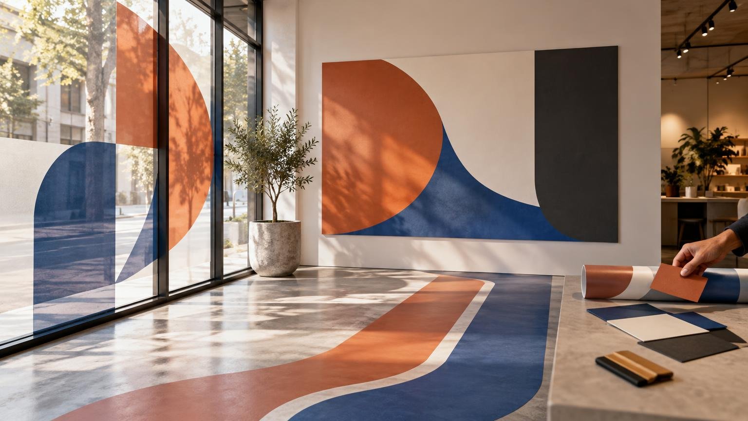
TLDR
This window wall floor graphics comparison comes down to audience and environment. Choose window graphics to reach people outside or use valuable glass frontage, wall graphics for sustained interior branding and longer messages, and floor graphics for short wayfinding or point-of-decision prompts. Then verify the exact surface, material system, cleaning routine, exposure, removal plan, and—especially for floors—safety documentation before production.
The surface is not just an empty place to put artwork. It controls who sees the message, how long they can read it, what physical wear it receives, and how difficult installation and removal become. Start with the communication job, then select a graphic construction that has been documented for the actual glass, paint, wall covering, tile, concrete, wood, or other finish.
Window, wall, and floor graphics at a glance
| Decision factor | Window graphics | Wall graphics | Floor graphics |
|---|---|---|---|
| Primary strength | Reaches exterior viewers and uses storefront glass | Creates sustained interior branding and storytelling | Directs movement or delivers prompts at specific locations |
| Typical sightline | Eye level or across a street, sidewalk, or parking area | Eye level within rooms, corridors, displays, and reception areas | Downward view while approaching or moving through a space |
| Best message type | Bold offer, identity, hours, privacy treatment, or campaign image | Brand story, environmental design, product explanation, or large visual | Arrow, zone marker, queue instruction, short promotion, or reminder |
| Light effect | Can reduce or alter incoming light and outward visibility | Usually little effect on ambient light | Usually no effect on ambient light |
| Physical exposure | Sun, temperature changes, cleaning, condensation, and contact near doors | Contact, abrasion, furniture, cleaning, and wall-condition issues | Foot traffic, rolling loads, moisture, dirt, cleaning, and edge wear |
| Preparation priority | Clean glass and confirm coatings or treatments | Confirm wall material, texture, finish condition, and material compatibility | Confirm the exact floor surface, finish, traffic, and complete graphic system |
| Campaign fit | Short promotions through longer storefront programs, subject to product suitability | Temporary campaigns through longer interior programs, subject to surface and film | Focused campaigns that can be inspected throughout use |
| Main risk to manage | Poor visibility, bubbles, adhesion problems, or unintended loss of light | Failure on textured or unsuitable finishes, or damage during removal | Slip, trip, edge-lift, wear, and maintenance compatibility |
No surface wins every campaign. A window can attract attention before someone enters, but it may be a poor place for dense copy. A wall offers more reading time, but only after the audience is inside. A floor can influence a route at exactly the right moment, yet it faces the harshest traffic and safety demands.
Choose the surface by visibility and viewer behavior
First decide where the intended viewer will be. A storefront campaign aimed at pedestrians or drivers generally belongs on the window or another outward-facing surface. Messaging for customers already browsing, waiting, or meeting with staff usually works better on a wall. Directions that matter at a doorway, junction, queue, or product display may justify a floor placement.
Match the amount of copy to the available attention. Window graphics viewed from a moving vehicle need a stronger hierarchy and fewer words than graphics facing a pedestrian queue. Walls can support a headline, secondary message, imagery, and a call to action because viewers may have more time. Floors should usually communicate in a glance. A directional arrow and destination are more dependable than a paragraph placed under people’s feet.
Map obstructions before designing. Door frames, handles, shelving, merchandise, parked vehicles, mats, furniture, and standing customers can all hide critical information. For door-specific information, the placement principles in this guide to store hours window clings for glass doors show why immediate legibility matters more than decorative complexity.
When window graphics are the right choice
Use window graphics when the campaign must work before the customer crosses the threshold. They are well suited to identity, promotions, opening information, large campaign imagery, and partial privacy treatments. Transparent, opaque, frosted, and perforated constructions create different relationships between image coverage, daylight, privacy, and outward visibility.
Perforated window film is useful when the design needs to appear comparatively complete from the printed side while retaining some ability to see through from the other side. For example, 3M describes one removable 4-mil perforated window film with a 40% perforation pattern intended to show an image outside while allowing viewing from inside. That is a specification for that product, not a universal formula for every perforated film.
Lighting still controls the effect. Perforated film generally works best when the printed side is brighter than the viewing side. At night, a brightly illuminated interior can make the perforations and interior scene more apparent from outside. Test the design during the actual operating conditions if nighttime presentation or privacy matters.
Glass preparation deserves the same attention as artwork. Avery Dennison advises testing perforated window graphics on the intended substrate because silicone and other low-surface-energy coatings can reduce adhesion. Its guidance also advises against wet application for perforated films because trapped water can obstruct vision. More broadly, moisture or contamination can impair adhesion, so glass should be thoroughly cleaned using the procedure specified for the selected film.
Before approving a full-window design, check whether the graphic could hide required signs, address information, door controls, sightlines, or other operational information. If store hours are likely to change independently of the main campaign, make them a separate replaceable element rather than embedding them in a large permanent composition.
When wall graphics are the better canvas
Walls are usually the strongest choice for interior brand-building. They support large photography, campaign themes, brand statements, product education, maps, timelines, and visual zoning without asking the viewer to look down or through glass. They also allow a message to become part of the environment rather than appearing as a temporary sign attached to it.
The creative advantage is reading time. A reception wall can introduce the brand; a corridor can carry a sequence; a meeting room can reinforce one central idea. Use that space deliberately. One strong visual system is usually more effective than stretching a small digital ad across a large wall without reconsidering crop, scale, typography, or viewing distance.
Material selection depends on the actual wall. Texture, paint type, paint age and cure, moisture, dust, previous coatings, repairs, and finish condition can all affect adhesion and removal. Do not assume that a film described as removable will leave every painted surface unchanged. Ask the supplier or installer to approve the substrate and conduct a small test in an inconspicuous location when wall condition is uncertain.
Design around the architecture rather than treating it as a production inconvenience. Measure corners, outlets, switches, trim, doors, vents, sprinklers, and furniture. Decide whether the artwork should stop short of these elements, incorporate them, or continue across multiple panels. This is where a site survey prevents an attractive concept from becoming an awkward installation.
When floor graphics earn their place
Floor graphics are best used for location-specific action: directing visitors, identifying queue positions, marking zones, leading customers toward a display, or reinforcing a short message at the point of decision. Their value comes from placement precision, not from turning every open area into advertising inventory.
The floor is also the most demanding option. Pedestrians, carts, wheelchairs, strollers, luggage, pallet equipment, grit, moisture, mops, waxes, disinfectants, and automatic scrubbers can affect performance. A construction suitable for light pedestrian traffic in a dry shop may not be appropriate for an entrance, hospital corridor, warehouse, or grocery aisle.
Manufacturer approval should cover the complete system and intended surface. 3M identifies specific recommended surfaces for certain floor-graphic constructions, including waxed vinyl, sealed concrete, marble, ceramic tile, sealed wood, and terrazzo, while calling for other surfaces to be evaluated. A generic statement that a product is a “floor decal” is not enough to establish compatibility.
Slip resistance also has to be evaluated at the system level. 3M reports slip-resistance results for specified protective products and warns that slip resistance for some directly printed products can decline as ink coverage increases. Ask for documentation that matches the proposed film, print method or ink coverage where relevant, protective layer, intended substrate, and use conditions. Do not transfer a result from one tested construction to another.
For United States workplaces covered by the rule, OSHA requires walking-working surfaces to be kept clean, orderly, and, where feasible, dry; inspected regularly; and corrected or guarded when hazardous conditions are found. OSHA’s walking-working surface requirements provide the official language. A campaign approval should therefore include responsibility for inspecting edges, wear, contamination, and damage—not merely responsibility for installing the graphic.
Surface preparation and installation checklist
A clean file cannot rescue an unsuitable surface. Complete the physical assessment before final artwork is released.
- Record the exact location, dimensions, substrate, finish, texture, and visible condition.
- Photograph the full placement and close-ups of seams, cracks, coatings, repairs, grout, and existing residue.
- Document indoor or outdoor exposure, direct sun, temperature changes, moisture, and nearby doors or HVAC outlets.
- Identify normal cleaning products, waxes, disinfectants, degreasers, tools, and cleaning frequency.
- For floors, record pedestrian volume and all rolling loads rather than describing traffic only as low, medium, or high.
- Confirm that the selected material construction is approved for the substrate and intended exposure.
- Request a small adhesion and removal test when the surface condition or coating is uncertain.
- Measure architectural interruptions and decide where panel joins and edges will fall.
- Assign installation, routine inspection, cleaning coordination, removal, residue cleanup, and finish repair responsibilities.
- Keep required signs, exits, controls, accessible routes, and critical sightlines unobstructed.
Artwork preparation follows the site survey. Build at final scale or a clearly documented scale, include the printer’s required bleed, keep critical copy away from panel seams and trim zones, and check image resolution at the produced size. For perforated windows, avoid relying on fine detail to carry the message. For floors, orient text and arrows for the approach direction rather than for convenience on the design screen.
Plan campaign duration and removal together
Temporary and removable are not guarantees of identical performance on every surface. Removal can change with the precise adhesive and film, substrate condition, paint or coating, sun and heat exposure, cleaning chemistry, installation quality, and how long the graphic remains in place. Choose the construction around the planned dwell time and removal conditions instead of asking for “vinyl” as if it were one material.
Short campaigns benefit from modular design. Put dates, prices, sponsors, or seasonal offers on replaceable sections while allowing durable brand elements to remain. This reduces waste and prevents a minor information change from forcing a complete reprint.
Longer campaigns require an inspection rhythm. Check corners, seams, edges, fading, abrasion, trapped moisture, residue, and any change in the underlying surface. Floor graphics need especially prompt attention because a damaged edge can become a trip concern. Remove or guard a questionable graphic until it can be corrected.
A practical window wall floor graphics comparison decision tree
- Identify the audience. Choose a window when the priority is people outside, a wall when it is people spending time inside, or a floor when the message must appear at a specific step in their route.
- Reduce the message to its real job. Use windows for attraction and entry information, walls for immersion and explanation, and floors for direction or a brief prompt.
- Check environmental constraints. Evaluate light and visibility for windows, texture and finish condition for walls, and traffic, moisture, cleaning, and rolling loads for floors.
- Confirm the material system. Obtain documentation for the exact film, adhesive, print, laminate or protective layer, substrate, exposure, and intended campaign duration.
- Test uncertain surfaces. A small trial is cheaper than widespread adhesion failure, damaged paint, obstructed visibility, or an unsuitable floor installation.
- Approve installation and removal as one scope. Name who prepares the surface, installs the graphics, inspects them, removes them, and handles residue or repairs.
What to include in a production quote request
A useful quote request should include dimensions, location photos, substrate and finish, indoor or outdoor exposure, desired campaign dates, viewing distance, artwork status, installation access, cleaning practices, and removal responsibility. For windows, add glass coatings, desired privacy, outward visibility, and lighting conditions. For walls, include texture, paint information where known, and recent repairs. For floors, include traffic types, cleaning equipment, moisture exposure, and the documentation required for the finished graphic system.
When the location and specifications are settled, you can compare installers and explore custom print production options using the same scope. Insist that every quote describe the proposed construction rather than giving only a total price. Two graphics with similar artwork can be materially different once film, adhesive, protection, site preparation, installation, and removal are included.
Choose the communication job before the material
The right branded surface is the one that reaches the intended audience without fighting the environment. Use windows to attract and inform from outside, walls to build a sustained interior experience, and floors to guide or prompt at a precise location. Then make production decisions from the actual substrate, exposure, maintenance routine, campaign duration, and removal plan.
If floor graphics remain in the mix, add one more standard: the finished system must be appropriate for the specific surface and operating conditions, with ongoing inspection built into the campaign. That combination of message, medium, material, and maintenance is what turns a graphic from decoration into a dependable piece of communication.