
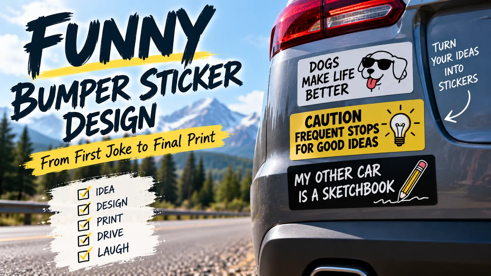
To design a funny bumper sticker for your car, develop a short slogan, build the layout at the intended size, and test a paper mockup before printing. Choose your printing method early so you can prepare the artwork for the right dimensions, material, and file requirements.
A sticker can look excellent when it fills your monitor and disappointing when it arrives as a small rectangle. The lettering is suddenly too small. The background competes with the joke. The illustration you spent an hour choosing turns into an indistinct blob.
That’s why I’d treat funny bumper sticker design as two connected jobs: writing something worth reading and making sure the printed object delivers it. You don’t need elaborate software for either job. You do need a process that catches problems before they become a stack of finished stickers.
Give Your Bumper Sticker One Job
Before opening a design app, write a simple brief. Decide who the joke is for, what it should say, and where you intend to place it.
For a personal car, the audience might be broad: anyone who understands the frustration of running unnecessary errands. Or it might be narrow: gardeners, tabletop players, musicians, or people with strong opinions about office meetings.
Both approaches can work. The mistake is trying to serve them all in one design.
Take this example:
“This Trip Could Have Been an Email.”
That line gives you a complete concept. Adding a company name, a second joke, a social handle, and a detailed illustration would change the assignment.
My suggested brief would be: “Create a text-led bumper sticker about unnecessary trips, with a deadpan tone and no supporting explanation.”
That sentence makes later decisions easier. An element either serves the brief or belongs in another design.
Develop Several Slogans Before Choosing One
Write a handful of alternatives rather than polishing the first phrase that comes to mind.
A useful exercise is to take one subject and try three different approaches. For errands, you could experiment with an exaggerated complaint, a small confession, or a nonsense title.
“Full-Time Errand Goblin” treats an ordinary routine as an occupation. “Forgot the One Thing” turns the same subject into a confession. Neither needs the same artwork as the email joke.
Show the wording to someone before adding visual decoration. Ask what they think it means. When the phrase needs a long explanation, revise the phrase rather than expecting the design to rescue it.
I’d also leave the shortlist alone for a little while and read it again later. The line you initially liked for its novelty may not be the one you want attached to your car for months.
There’s no scientific word limit here. My starting preference is one short sentence or two compact lines.
Choose the Finished Size Before Building the Layout
Measure the area where you intend to place the sticker. Keep lights, plates, cameras, and sensors uncovered, and consider how much space the design needs around it.
Then choose an actual production size. For reference, CustomStickers lists bumper sticker options including 7.5 × 3.75 inches, 11.5 × 3 inches, and 15 × 3.75 inches.
Those proportions support different layouts. A long, shallow rectangle encourages a horizontal phrase. A taller format gives you more room for stacked text or an illustration.
Here’s how I’d approach the choice:
| Design concept | Starting layout | What to test |
|---|---|---|
| One short phrase | Wide rectangle with a single line | Whether the lettering is large enough |
| Setup plus punchline | Two text lines | Whether the reading order is obvious |
| Character with caption | Taller rectangle | Whether the character steals space from the words |
| Minimal symbol and slogan | Text with one small graphic | Whether the graphic adds meaning |
These are starting points, not specifications. Make the format fit the idea instead of squeezing the idea into a shape you picked at random.
Build a Layout With a Clear Reading Order
The viewer should not have to decide where the sentence begins.
For the email example, try two lines: “THIS TRIP COULD” above “HAVE BEEN AN EMAIL.” Keep both readable, then experiment with slightly emphasizing the second line.
Another version could keep the entire phrase on one line. Print both and compare them. The simpler arrangement might be the stronger one.
Use one main font while testing. Choose a background that clearly separates from the lettering, and leave room around the message. Short text, bold legible fonts, and high-contrast colors are common recommendations in bumper-sticker design guidance.
Don’t shrink the lettering automatically when the phrase doesn’t fit. First ask whether the wording can be shorter, the line break can move, or an unnecessary graphic can disappear.
A useful design decision often looks like removing something.
Pick Software Based on What You Need to Make
For a straightforward slogan, Canva provides a practical workspace with sticker templates, text tools, graphics, and artwork uploads. Begin with the dimensions of your intended sticker rather than an unrelated social-media format.
Adobe Illustrator is worth considering when you need detailed control over vector artwork, custom shapes, and lettering. Its vector-based approach is also useful for designs you plan to reuse at different sizes.
The important distinction is between the file you edit and the file you send to print. Keep an editable master so that changing a word or moving a graphic remains easy. Export a separate production file once the design is approved.
I’d also name the files clearly. Something like errand-sticker-11-5x3-final.pdf is easier to identify than sticker-final-final2.pdf. It’s a small habit that becomes useful as soon as you have three competing versions.
Prepare the Artwork for Printing
Check your chosen printer’s requirements rather than assuming every service expects the same setup.
Resolution
CustomStickers recommends raster artwork at 300 pixels per inch at the finished size. For an 11.5 × 3-inch sticker, that works out to 3,450 × 900 pixels, before any additional bleed requirements.
That calculation describes the required pixel dimensions. It doesn’t mean a small image gains detail simply because you resize it to those numbers. Pixel-based images can lose apparent sharpness when enlarged; vector shapes can be recalculated at different sizes without that same limitation.
Bleed and Safety Space
Bleed is artwork extending beyond the intended cut edge. Safety space keeps important content inside that edge.
CustomStickers’ bumper sticker guidance specifies a 0.05-inch safety margin for bordered designs and approximately 0.03 inch of bleed for full-bleed setup. Treat those as that printer’s specifications, not universal measurements for every supplier.
Give the wording comfortable visual space as well. A production minimum is not necessarily the amount of breathing room that looks best.
File Format
Use a format the printer accepts. PNG can be useful for raster artwork with transparency, while JPEG does not support transparent backgrounds. PNG also uses lossless compression, unlike JPEG’s lossy compression.
For a text-and-vector design, ask whether the printer prefers a PDF or another vector-capable format. Whatever you export, reopen it and check the result. Don’t assume the export matched the editable file.
Compare Home Printing With Ordering Finished Stickers
Home printing makes sense as a project when you enjoy testing materials and already have suitable equipment. It also lets you experiment without committing to a larger order.
But check the complete material system. Cricut’s Printable Waterproof Sticker Set uses printable vinyl plus a separate laminate and requires an inkjet printer. The manufacturer identifies the adhesive as permanent and notes that ink colors may still fade depending on the ink formulation. Those details matter more than the word “waterproof” by itself.
For a finished sticker without the printing and cutting work, CustomStickers.com offers artwork upload, laminated vinyl stickers, and an optional free digital proof. Request the proof so you can review the sizing and cutline before production.
I’d compare the total job rather than just the price of a sheet of material. Home production includes printing, drying, laminating, cutting, and any unsuccessful attempts. Ordering finished stickers moves those tasks to the printer.
Check the Proof Without Rushing
A proof is worth more than a quick glance at the overall appearance.
Read the wording character by character. Check the dimensions against your paper mockup. Look at the cutline, the margins, and the relationship between the artwork and the sticker edge.
My final review would cover three things:
- Content: Correct wording, punctuation, and artwork version.
- Layout: Comfortable margins, clear line breaks, and the intended cut shape.
- Order details: Correct size, quantity, material, and finish.
Then look at the exported file and proof side by side. You’re checking that the production version represents the design you approved, not judging the joke all over again.
For a larger order, consider starting with a small physical run. A screen preview cannot tell you everything about how the finished object feels or looks on your vehicle.
Bumper Sticker Printing FAQs
Can I design the sticker on my phone?
Yes. Canva supports sticker design through its app as well as its website. I would still print a full-size paper mockup before ordering, because working on a small screen makes physical size harder to judge.
How many words should I use?
Start with a short phrase and make the lettering as clear as possible. My working target would be roughly three to eight words, but the paper test matters more than hitting a particular count.
Should I add a QR code?
For a personal joke sticker, I would leave it out. It introduces a second purpose and takes space away from the message. Keep the design focused on the joke you set out to make.
Finish the Design Before You Finish the Order
A successful funny bumper sticker needs a good line and a practical layout. Get the wording right, choose the actual size, and test the result on paper. Then prepare the file to the printer’s specifications and review the proof carefully.
You don’t need more effects, more fonts, or more software. You need a joke that works without explanation and a printed design that gives it room to work.